Gone are the days when just having a basic business website was enough to tick the box on the marketing to-do checklist. Visitors and customers are increasingly expecting greater things from their online experience; they want to find content and resources that help them make choices, they want to buy or amend things 24/7 and be able to manage their relationship with you when it suits them (not you). By optimising your website around the customer you can drastically improve how visitors interact and drive up revenue or cost savings. Read on for our top 5 website optimisation tips….
Convenience is now the new king
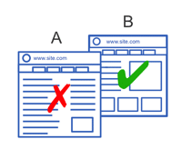
Time is a very precious commodity today and customers want to get as much done as possible in the minimal amount of time – how do they do that?… They’ll use websites that make the shopping experience as simple and easy to use as possible. If it’s easy to understand and use, it saves time, hence the rise of the online mega shops like Amazon, eBay and disinter-mediated experiences like Google Shopping. So how can smaller businesses make it easier for their online visitors? In a word…. optimisation. All serious website owners are now investing in sales optimisation – also known as conversion rate optimisation – on a regular basis, treating it as importantly as they do their marketing budget. Continual improvement is the key to keeping your customers happy and coincidentally, increasing your online sales and service conversion rates. So here are our top 5 website optimisation tips for improving your website.
Top 5 Website Optimisation Tips
1. Website Analytics – tracking what your visitors do
Before you do ANYTHING to your website you need to implement at least the minimum level of website tracking, generally page-level tags. Probably the best, easiest and cheapest way to do this is via Google Analytics. You can sign up online and have a tracking code ready to paste into your site in minutes. This is what it’ll look like:-
<script> (function(i,s,o,g,r,a,m){i[‘GoogleAnalyticsObject’]=r;i[r]=i[r]||function(){ (i[r].q=i[r].q||[]).push(arguments)},i[r].l=1*new Date();a=s.createElement(o), m=s.getElementsByTagName(o)[0];a.async=1;a.src=g;m.parentNode.insertBefore(a,m) })(window,document,’script’,’//www.google-analytics.com/analytics.js’,’ga’); ga(‘create’, ‘UA-87654321-1‘, ‘auto’); ga(‘send’, ‘pageview’); </script>
Google gives you clear instructions about how to set up the account and how to copy and paste this tracking code into your website – you’ll need admin access to your website to be able to do this though. If you employ a webmaster or use a web design company speak to them – failing that we’d be delighted to help. Once this has been set up you’ll have to wait until there’s enough data to provide meaningful information. Depending on how popular your website is this could be hours, days or even weeks. But that shouldn’t stop you investigating others areas for improvement (see below). After the initial data collection period you’ll be able to see a lot of information about your visitors, where they come from, where they go to and where they leave from on your site. With a simple page tag Google Analytics can provide a huge amount of data that you can use to start understanding your site and your visitors. 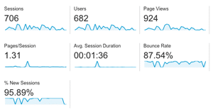 But what you generally won’t be able to see with this type of tracking is anything that visitors do that requires input, output or processing of data – for example filling out web forms like contact us, email newsletter sign-up or ecommerce functionality like shopping basket/checkout processes. You can track completed processes by creating html based confirmation pages which will be tagged as part of the basic analytics tracking discussed above, but you won’t be able to see how far through your application customers got before abandoning – and it’s this type of info that’s really useful in understanding where your design issues may be. To get this more detailed and sophisticated type of tracking you’ll really need the help of a web developer as it requires some java script coding experience.
Heads Up: Please be aware that as soon as you start tracking and storing information about visitors you will need to implement a cookie policy allowing opt in/out of tracking. This even applies to essential tracking items that allow certain elements of your website, like shopping basket processes, to function. For more info about this and other tips please contact us.
2. Masthead design
Your masthead is arguably the most important part of your website. It’s the most stable element on your site and should remain unchanged regardless of the pages that a visitor may go to. It provides a reassuring island of calm in what can be a confusing journey your visitors experience to find what they’re looking for. 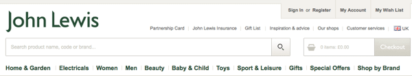
Corporate Identity
By default a masthead should contain your corporate identity. This might include your corporate colours/colour scheme but will definitely contain your corporate logo and strap-line/motto – essentially something in writing that describes what your business does. It should be instantly recognisable to anyone familiar with your business. The logo will also act as a “Home” button transporting lost visitors back to your home page in the event that they become lost deep in your site whilst searching for a product or service. Ok so the corporate identity stuff is done, what now?
Navigation Headings
![]()
The next most important part is your site’s navigation headings. This tells users what they can expect to find in your site. A word of warning – you must use headings which prospective visitors will easily understand. It’s no good calling your widgets “Apples” when everyone would call them “Bananas” no matter how desperate you are to differentiate yourself *. It’s usual nowadays for the navigation headings to expand when the user hovers over the navigation tab, revealing a much more complete listing of the pages and sections within that particular navigation heading
*This is a really important element to understand and has a major impact on how Google and other search engines interpret and rank your site. If the words you use, including navigation headings and page titles, aren’t the same as those being used by customers on search engines don’t expect many visitors – unless of course you aren’t relying on search engines for any traffic….
Site Search
In general there are 3 main ways in which visitors will find their way around your site:-
![]() the navigators – these people use the main navigation tabs and headings we’ve already talked about
the navigators – these people use the main navigation tabs and headings we’ve already talked about
![]() the content clickers – this second type will use the engaging body copy content that you’ve carefully crafted
the content clickers – this second type will use the engaging body copy content that you’ve carefully crafted
![]() the last main group, the searchers, will default to using the site search function first as they feel it’ll be faster and more efficient to get to where they want to go
the last main group, the searchers, will default to using the site search function first as they feel it’ll be faster and more efficient to get to where they want to go
So unless you want to alienate the group of visitors that prefers to use site search, it’s really important to have a search box on your site. But there’s another good reason (if that wasn’t good enough already). Visitors that fail to find what they want first time round will often try again using your site search as a next best option, thereby giving you a second chance.
Heads Up 2: Make sure that the site search function you use is up to the task. We’ve seen many businesses with very poor site search quality, to the point where it really wasn’t worth having. The algorithm that’s used needs to be able to account for plurals, spelling mistakes and incorrect punctuation – just like Google’s search function. You’ll also need to make sure it can correctly and fully collate and cross-reference all of your products, services and the text used to describe them. There are many good quality site search plugins you can use, including from Google itself. So make sure you use them.
Shopping Basket Summary
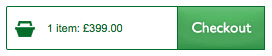
Do you have an ecommerce site? If so your masthead should include a shopping basket summary section that keeps your visitors informed about how much they’ve put in their basket (ideally number and value) and a means to go to the checkout to complete their purchases.
The summary basket element will also act as a confirmation that the item the customer has selected has actually been added to the shopping cart.  In terms of visual cues, there are many ways to dynamically show users that items have been added to the basket but that’s really more to do with the content and ecommerce sections that we’ll cover later.
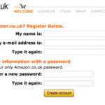
Login / Register function
![]()
Usually if you have ecommerce functionality on your site you’ll also need a secure area where customers can log in to manage their account, see their order history and view and amend any data you hold about them. But don’t think just because you don’t do ecommerce that a ‘My Account’ area isn’t needed. Any time you hold customer info it’s likely that you also need to provide access to it so your customers can control and update it.
This is also likely to include customer preference data too, like how and when you contact them and for what purpose. Allowing users to access their data online may also benefit your business too by substantially reducing admin costs as users will effectively be amending and keeping records up to date themselves – plus it’s likely to be much more accurate.
However, providing access online means you must make sure you follow the relevant regulations about holding this sort of info and ensure that your security systems are robust and regularly tested. Ok so that covers customers that are already registered – how about new customers?
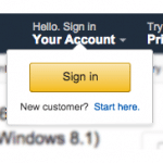
Make sure there’s an obvious way to register and create an account online – some users may want to create one before they purchase, others won’t so you need to ensure the design you choose elegantly captures the data you need to create a profile with minimal intervention.
Good examples will collect the user’s info during the checkout process, requiring only the minimal extra information to generate an account – usually only the username and password – everything else is input by the customer as part of their normal checkout interaction.
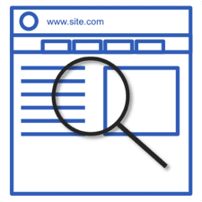
3. Content
![]() Often the most overlooked part of your website, your content is the main engine that drives traffic to your site so make sure it’s effective. Many businesses just try and get away with the minimum amount of content to get the website live and save time for other pressing matters. But this is a mistake. You need to think about what you look for when you go shopping online and create content accordingly. Here are a few key points that are important to get right:-
Often the most overlooked part of your website, your content is the main engine that drives traffic to your site so make sure it’s effective. Many businesses just try and get away with the minimum amount of content to get the website live and save time for other pressing matters. But this is a mistake. You need to think about what you look for when you go shopping online and create content accordingly. Here are a few key points that are important to get right:-
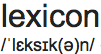 Lexicon: you must use your customers’ language – and I don’t mean French, Polish or Arabic – I mean you need to use the same words for your products (and services) that your customers are using when they search online. A good example here is a real-life one; HSBC’s product team chose to call their credit card for businesses a “Commercial Card” – but prospective customers were searching using the words “business credit card”. Needless to say the volume of searches for ‘Commercial Card’ were close to zero, while ‘Business Credit Card’ was in the thousands. Getting the words you use right is also an important element in any Search Engine Optimisation (SEO) strategy.
![]() Taxonomy: a technical word which basically means how your content is grouped and structured. Make sure content is grouped together logically – and again I mean a logic your customers would understand – not how you would classify them. For example imagine you sell seeds online; you may think it’s logical to group melon seeds with pumpkin seeds. This might be scientifically correct, but most people would look for melon seeds under the ‘Fruit Seeds’ section and pumpkin seeds under the ‘Veg Seeds’ section.
Taxonomy: a technical word which basically means how your content is grouped and structured. Make sure content is grouped together logically – and again I mean a logic your customers would understand – not how you would classify them. For example imagine you sell seeds online; you may think it’s logical to group melon seeds with pumpkin seeds. This might be scientifically correct, but most people would look for melon seeds under the ‘Fruit Seeds’ section and pumpkin seeds under the ‘Veg Seeds’ section.
 Imagery: this includes pictures, artwork and video. No-one like’s using websites that are huge blocks of text so break up your written content with interesting images and interactive media – stuff visitors can get involved and play with. Make sure that if the imagery you’re using is helping to describe a product you want to sell it can be enlarged to show a high quality image that gives a good impression of what the product actually looks like. Many sites still produce an image only slightly larger than the default thumbnail one.
![]() Text size: one of the most overlooked elements of any website is the actual default size (and font) of text you use on your site. Many websites use a font size that’s way too small for normal use and this causes many people to struggle to read that useful and interesting content you’ve spent hours producing. This is especially true for mobile devices that are often out in bright light or used on the move – small text and a moving screen can really work against you… So make it easy for your users and make your text bigger. The type of font you use is important too – don’t be tempted to use a font which looks like handwriting or old or funky. This forces users to slow their reading down just to decipher what you’re trying to say – unless you’re the only person selling what it is your visitor is after they will quickly go elsewhere to where it’s easier to understand and ultimately buy.
Text size: one of the most overlooked elements of any website is the actual default size (and font) of text you use on your site. Many websites use a font size that’s way too small for normal use and this causes many people to struggle to read that useful and interesting content you’ve spent hours producing. This is especially true for mobile devices that are often out in bright light or used on the move – small text and a moving screen can really work against you… So make it easy for your users and make your text bigger. The type of font you use is important too – don’t be tempted to use a font which looks like handwriting or old or funky. This forces users to slow their reading down just to decipher what you’re trying to say – unless you’re the only person selling what it is your visitor is after they will quickly go elsewhere to where it’s easier to understand and ultimately buy.
4. Ecommerce
 We’ve already covered some of the functions we’d class as ecommerce, for instance the shopping basket summary, the content you need to help visitors decide to buy and the language of words you need to use. Now we’ll talk more about up-selling additional products, the shopping basket process, recognising previous visitors, and registration of new users.
Up-Selling
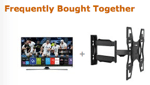 One of the most common types of up-selling strategies is to group items together on the main product page that are often purchased together. In the example above the main product page is for a TV and the primary up-sell promotion is for a wall bracket, but it could quite easily be cables, an AV stand or Hi-Fi equipment.
Other types often include indirect recommendations in the form of ‘Other Customers Who Bought This Item Also Bought’ and ‘What Other Items Do Customers Buy After Viewing This Item?’.
Amazon has probably spent more time experimenting with this type of additional sales technique than most and has not 1 but up to 8, ….yes 8, different cross-sell or up-sell elements on a given single product page, and that’s not including external third party sites.
Here’s the example amazon.co.uk product page I used so you can see it in the flesh. No wonder their pages are so long…
To show you here are the elements for the TV example above:-
- “Frequently Bought Together”
- “Sponsored By Other Brands”
- “Customers Who Bought This Item Also Bought”
- “Sponsored Products Related To This Item”
- “What Other Items Do Customers Buy After Viewing This Item?”
- “Customer Reviews” – although not directly promoting up-sell/cross-sell there is an advert on the right hand side of this section promoting other products
- “Look for similar items by category”
- “Your Recently Viewed Items and Featured Recommendations”
In addition there are 2 extra links or sections promoting external vendors for the same, similar or related products.
- “Product Ads from External Websites” – not strictly an up-sell/cross-sell but an additional revenue stream none-the-less
- “Customers Viewing This Page May Be Interested In These Sponsored Links” – same as previous item
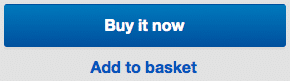
Shopping basket process
![]()
Ok, so visitors are putting items into their shopping basket on your site, but is your checkout process any good? The shopping cart process usually consists of two parts:-
- the pre-checkout summary and,
- the checkout process proper
Most retailers will continue to promote offers and related products on the pre-checkout summary page because it’s the retailers’ last chance to get visitors to add things to their basket. However after this point successful retailers know that the golden rule of good checkout process design is to remove any unnecessary distractions. This includes the standard site navigation as well as any additional up-sell/cross-sell offers. 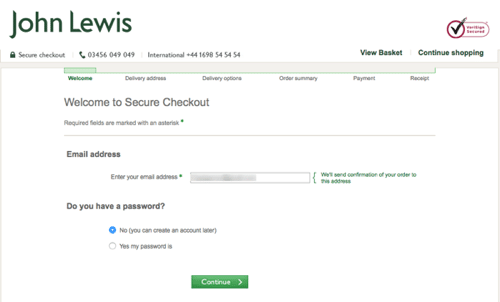 The purpose of the checkout is to focus the visitor on completing the purchase.
So the standard navigation gets replaced by the different steps needed to take the delivery address and payment method.
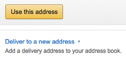
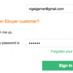
Switched on retailers recognise that some visitors want to buy their items without the need to register – imagine having to sign up to a store card at the supermarket checkout just to buy your groceries….
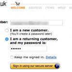
But those that are already registered need an easy way to sign in, either by a radio button like in the John Lewis example above, Amazon.co.uk below, or a more segmented approach used by others where there are separate login panels for ‘existing customers’ and ‘new customers’.
Wherever possible you need to allow the user to store their details to make recalling their username and password as easy as possible.
For repeat buyers, your checkout form should recall all of their previous details, like address (or addresses if they’ve used more than one in the past) and payment options.
Delivery options are usually different depending on the type of item purchased so are usually specified each time.
Registration of new users
 For new users you need to simplify the capture of all data, especially their address as this constitutes an area where a lot can go wrong. It may be that you don’t need a physical address at all, in which case an email will be the main method of communication.
Consider too whether it’s appropriate to collect their social media details too – this should definitely be optional and there needs to be a really good and compelling reason for them to give it to you (for example first to hear about offers and discounts) – but it’s far easier to instigate an outbound campaign when you already have their details than to recruit them later via less well targeted social media mass-marketing.

For physical addresses, if you’re collecting them, use look up tools that can expand based on post code searches, like the one above from Crafty Clicks. You should implement this regardless of whether the new user is registering for an account or using the guest checkout option.
Heads Up 3: When using address look up tools make sure there is a manual override so that users can correct any errors that may be in the database. On occasion the users address may not even show if their house is a new build and hasn’t been fully registered into the postal services systems yet.
 Think about whether users need to register a different address (i.e. a shipping address) to the one you’re going to send any correspondence or copy invoices to (i.e. a billing address). This is relevant if you’re selling to businesses with multiple offices and whether people would likely to want to order something to be sent to friends or family.
The order in which you ask for personal information can also have a huge impact on the completion rates. Amazon.co.uk does this in bite sized pieces for new users starting with a name, email address and password.
Completion rates are especially affected if the transaction doesn’t involve physical goods that need to be shipped. There needs to be a logical reason for collecting items of personal data and you should be upfront about why you need them – usually either as static text next to the data capture field itself or in the field level help text which is triggered on hovering over a ‘?’ or other help iconography.
Heads Up 4: Good quality data field labels and field level help text is vital to provide users with additional support in understanding what it is you want them to do. Don’t assume that everyone will be able to decipher what the field is asking for so make sure you test your forms on a wide range of people at different levels of online experience as possible. A good idea is to get a friend’s 14/15 year old to try and complete the form – areas where they struggle are a good place to start improving. This, plus how and where to put your field labels, is a whole industry in it’s own right and something you should get help with. Even using the same text in different places around a field can have up to 40% difference in completion rates.
Recognising previous visitors
 Wherever possible you need to remove unnecessary steps from the checkout process and, if you can, recognise returning visitors at the point of entry to your website (not just the checkout stage). If your tracking systems are able to recognise them as they enter your website you’ll benefit from a significantly higher level of accuracy in your website analytics data, not to mention the targeted marketing opportunities this can provide. For returning customers going through the checkout process that means minimal rekeying of data. Pre-fill as much data as you can to reduce the amount of key strokes required by a customer to authenticate themselves again and get to the info you don’t know already about. This ‘unknown’ data is usually around delivery speed/costs, payment method to use and where the item is meant to be delivered to – these are often the data that can change from order to order.
5. Ongoing Site Development
 Ok we’ve covered quite a lot of ground with these top 5 tips, but actually this is just the tip of the proverbial iceberg. You may think ‘tick’ we’ve done all of this but actually optimising these things isn’t a one time activity. It’s something that requires continual monitoring and improvement. Just like your marketing isn’t a one-off exercise, optimisation should become ingrained in your business as part of your business as usual, becoming part of everything you do – even your marketing campaigns will seriously benefit from data analysis and optimisation. A continuous improvement cycle is key to your business’ success.
Test and Learn
 An important element to your continual improvement process is the ability to test and learn. This is something that develops after you become familiar with making ad hoc changes and reviewing the results. However, making changes to your website and simply measuring the results isn’t a very accurate way of discovering the real impact of the change. For example, let’s say you change the product title on a page. you then measure the impact in Google Analytics and find that page views have gone up by 10% – excellent! Unfortunately it’s not that simple. That 10% increase could be a normal increase you’d see between the days you’ve looked at (e.g. a Monday and a Tuesday), or even week 1 of a month vs. week 2. The fact is that unless you test your new version against the old version at the same time you’ll never really be able to tell if it’s a real change to performance or a timing/seasonal effect. By comparing the different versions on a like for like basis the impact of your new design will become clear and measurable. It may sound impossible to test different versions at the same time – after all you only have one website and all of your visitors go there right? The trick is to use testing tools, like Optimizely, which effectively allows you to send some of your visitors to one version and the rest to the other version. This is known as A/B testing. You can test even more versions at the same time too (known as A/B/n) but you need a lot of traffic to make this work as these tools need a fairly large amount of visitor volume to work out an accurate result for the test. Results can start to filter through as soon as you go live with the test, but you’ll normally have to wait a couple of weeks before the outcome becomes stable and reliable. Be warned this can type of testing get really addictive!
Segmentation
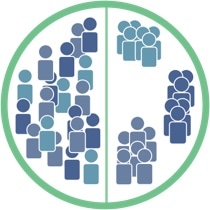 Once you start optimising your website and begin reviewing your website visitor data you’ll soon discover that your visitors can be grouped into distinct segments. For example some visitors may be new to the site, some may be coming back to sign in and get access to their order history, while others may be looking for a user manual for something they’ve already purchased. Understanding these groups and what they’re looking for helps you to design content, navigation and journeys that help these segments achieve their goals simply and effectively. The more your site helps your various users the happier they’ll be….. and you know what they say about happy customers 😉 If you’d like to find out more about how sales optimisation can improve your website call us on 01438940548 or contact us via Twitter, Facebook or Google+. If you’d prefer to email us you can contact us here: info@salesoptimisation.co.uk
Recent Comments